
Milton Glaser is a graphic design legend. The 84 year-old has been in the business for longer than many of us have been alive, and has been responsible for everything from the now-ubiquitous “I ❤ NY” logo, to the visual identity for the upcoming Season 7 of AMC’s Mad Men. The gentleman truly knows his stuff.
Glaser also created the brand identity for the Brooklyn Brewery, which means he’s gone first-hand through the exercise of deciding what works and what doesn’t when it comes to beer labels. He came to the conclusion that to properly brand an “outsider” like a craft brewery, you must create a compelling design that works hard, but isn’t too polished.
“The one thing you don’t want to look like is Budweiser,” Glaser told the New York Times Magazine. “This creates a paradox: How do you deliberately create the illusion of not knowing what you’re doing when you actually do?”
He recently reviewed the labels of several craft beers for the magazine, and I found his insights to be interesting and (in the case of Dogfish Head) a little stinging.
Glaser’s full list of label critiques can be found here, but I’ve cherry-picked a few of my favorites below:
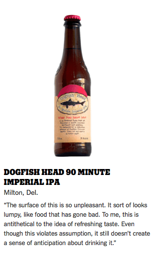
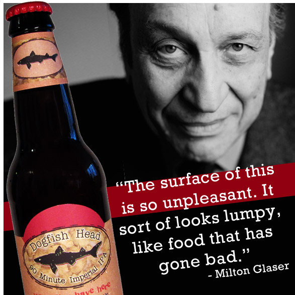
I wonder how Glaser would have felt about the original Dogfish Head 90 label. Totally chic, or too much freak? At any rate, it’s worth a click over the The Times to see the rest of beer labels Glaser puts under his microscope.
If there’s one thing this exercise tells us, it’s that the craft beer industry is all grown up if a legend of commercialism like Glaser is studying its brands in The Times.
But don’t feel bad for loving your favorite craft beer brand – if you’re going to practice conspicuous consumerism, it’s hard to imagine consuming anything better than a tasty craft beer! 🙂
.
.
.


Interesting and in an increasingly crowded field, standing out is good. But the beer does the talking and if it’s good, it won’t matter what the label looks like. That said, I stay away from cartoonish labels, Clown Shoes for one.
Well there’s the thing – the labels do the talking at the shelf, where many buying decisions are made. I agree that the beer is what matters, but if you never buy it, you’re never gonna try it.
To be honest, I don’t give a flying fart in a windstorm what the label looks like. If its new and the description on the label sounds good I’ll buy it. If its an old standby I’ll by it. Ya can’t drink labels–at least not yet. (Did he bother to taste any of those beers btw)
Unrelated: 60 Minute IPA lost out (6 to 3) to Mad Fox Orange Whip IPA in DC’s latest beer tasting competition–and it had nothing to do w/ the label.
I’d love to see flavored labels, ones that are artfully paired with what’s in the bottle – then you COULD taste the labels! I wonder if you can print on beef jerky…
I can see the headlines now. Crazed NJ Man Arrested While Licking Beer Bottles.
In my experience craft beer drinkers are fairly well educated with the major players shown here and label art doesn’t make any difference. I see this being an issue for the up and comers trying to get new buyers from the shelf. This is still a tap handle-first industry where brands gain traction at the local level in restaurants and bars before they can dream of getting shelf space at a retailer. I would like to see his critique of tap handles.
That would be interesting, as the good ones are 3D representations of an idea, not just a peg with a logo on it.
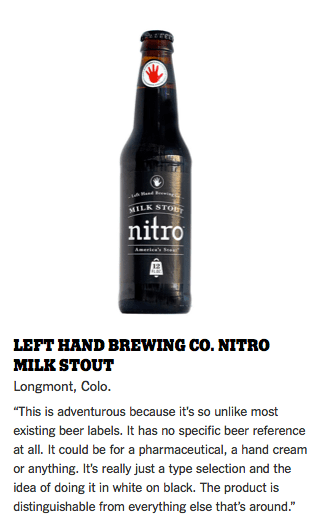
Yes, the MILK STOUT bottle doesn’t mention beer anywhere on the label except when it says “MILK FUCKING STOUT.” COULD BE A GODDAMNED HAND CREAM OR SOME SHIT LIKE THAT. Idiot.
For what it’s worth, I prefer the original 90 minute labels.
Yes, a hand cream that comes in beer bottles…genius!
So, this dude is a legend…in his own mind. I hate pompous “legends.”
Aren’t you a legend in COMO, Zac? 😉
Well, no. I am also a legend in my own mind. FML.
Reblogged this on Eat Drink Maine and commented:
A really interesting article about beer label design, by the Beer and Whiskey Brother’s blog.
Great post,I really enjoyed it.
Thanks, EDM!
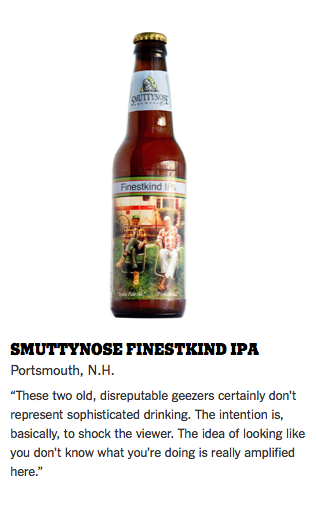
Interesting that he chose to review Smutty’s Finestkind over Homonculous…
Too bad my homebrews are too small time. I’d love his take on my Honey Badger IPA label.
Cheers!
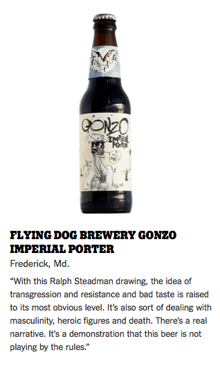
If I reviewed Homonculous, I’d HAVE to use the word “spunktacular!”
As said, its what’s inside the bottle that counts. I’d say that most craft brew drinkers dont shop for the prettiest labels, they shop based on recommendations from their buddies. At least that’s the way I do it. Cool label does not equal quality brew.
But for folks who are beer curious in the grocery aisle, they’re vital to a brand being sampled. They don’t need to be fancy, just attractive in some way.
They also read beer blogs fro recommendations.
God help ’em!!