

UPDATE: I give up – I missed the old layout too much. It’s neater, warmer and the comments sections is far superior. It’s like coming home! 🙂
As you might have noticed, we’ve updated the layout of the site. This was done for a couple of reasons. Number one, we got bored. It’s fun to shake stuff up once in a while. Number two, we’ve been getting a lot of traffic from social sharing sites and Google searches, and most folks land on a post and then head over to the home page to see what the site is all about. We like this new layout because it allows them to see many posts at once to get a sense of what we have to offer (not much, but hell, why prolong the obvious?). That’s what we like about this theme.
What we’re not so crazy about is how the comments now look. We think they were easier to follow before, but maybe that’s just because we were used to the old layout. Also, the new layout lacks the warmth of the previous one. Unfortunately, our site is hosted by WordPress, and there are very few customization options, so you have to take the good with the bad when choosing a theme.
That’s our take – what’s yours? Do you like the new look, or is it a total FAIL? Please let us know below – We can always flip the switch back to the old site if need be. Thanks!
.
.
.


If you install a theme like Thesis it is almost completely customizable, Jim. My site is a WordPress site too and I pretty much made everything look the way I wanted it to save for a few basics.
I don’t see that on the option list. Hmm…
…And are you saying we should keep trying? 🙂
All I’m saying is, as the old B.T. Express song says, “Do it ’til you’re satisfied” 🙂
Looks nice, but if there are things you’d rather change, then change ’em! Email me if you want.
The layout is nice. This new approach to have a layout that looks more newspaper-like is a positive. Plus, it doesn’t look as if you designed your site for people with poor eyesight anymore. I’ll wait on judging the comments until I see a few.
I’m planning to move to my own domain this summer and am considering a similar layout.
Thanks for the feedback, Zac (that rhymes!!)
We post pretty often, and I like how this layout allows us to show all the latest posts we’ve churned out.
Yeah, we’re using something similar at a local blog I’m working on and it’s gone well. If you’re posting a couple times a day, it makes sense to have as many posts visible on one page. The traditional blog layout that requires you to scroll forever doesn’t offer as much exposure.
Yours is one of the few blogs I’ll visit as the posts take a long time to hit my Reader and I hate being buried in comment threads.
This is kind of funny. I took a good hard look at it before reading this article and had the following reactions:
-I like that you can see multiple posts at once* (more on this in a sec)
-I like that it’s very clean and simple without being boring. I particularly like the textured look underneath your masthead
-I don’t like that it abandons the old look, which seemed to fit the classic “beer logo/design” feel to a tee (in other words, the other one was more ‘warm’, as you put it)
-It’s a bit risky from a branding perspective because you had a popular look and feel before. That’s not to say that it’s a BAD thing, per se. Just that you lose some of the brand identity you’ve built for a cleaner, simpler, more modern look.
It seems that you’ve got a lot of those same reactions. And to me, that means that you’ve put a healthy dose of thought into it and that your judgment is perfectly trustworthy.
As for the “see more posts” thing, I think there’s something to be said for making people dig at least a little. Not a lot. My hunch is that visitors want an interactive experience, something that they can get their paws into and get dirty with. This is perhaps the other side of the multiple posts coin.
My two cents. And of course, most importantly, as long as you keep providing your excellent content, the rest will work itself out. Seriously. You could do this:
http://wonder-tonic.com/geocitiesizer/content.php?theme=1&music=3&url=https://beerandwhiskeybros.com/
and I’d keep visiting anyway because of the content.
John has good points. I’m wondering if you could clean up your banner to match the sleeker look or soften the overall theme to match the banner.
Also, on the note of digging around and interactivity, your blog’s strong point is that you both respond to nearly every comment. Honestly, I come back more often for that reason than the design.
Thanks, Zac. I don’t think we’d be doing this anymore if it weren’t for the interactions with readers. It’s the best part for us.
That’s a good heads up on the logo as well. I modified it to fit the space, but I might have to blow it up and reconceive it to fit the new theme.
Maybe enlarging the glasses and the font would do the trick. I think altering what you have will insure that the branding you’ve done so far isn’t lost.
Yeah, thinking about blowing it up and moving on to something new…
I agree about the digging part, John. People have grown used to scrolling thanks to Facebook. But I also like sites where I can see a snapshot of what’s available, and then dig in deeper if I wish.
I’d prefer us to be able to have a single “featured” post on the top, then lots of little boxes below with other posts, but I can’t seem to find a theme to accommodate that.
I also agree with the loss of warmth and a bit of brand identity. I wish I could “brown” this sucker up, but I can’t!
Here’s a link to the blog we’re doing that features a slideshow at the top in order to focus readers on a few posts. The colors and banners will be completely redone in the coming days, but the layout is the way we want it for now.
http://thecomocollective.com/
I like that Zac. Kind of what I had in mind for us.
I dig it. I’d try to make your photos less deep though in this format. Or pick a standard, more shallow size or two for your photos. The varying photo sizes is making the page look a tad messy. When you have a really deep photo, like the buffalo trace one, it takes a while for you eye to get from the headline through the visual to the story copy–during which time your eye gets pulled to the headline or visual next it.
Just my two cents.
I wish Don could learn how to edit photos (most of the ones I create are 500×500), but that’s like teaching a bear to play frisbee.
STFU
MORE BEARS!!!!!
HA! I just made a bear comment above in response to Chad before seeing this. Great minds, John!
Here’s a blog that gets it right: http://bearlawyer.wordpress.com/
I think I prefer the old site, especially with regard to the comments section. I agree with BeerPoet in that the home page layout gets kind of messy as you scroll down.
Whatever you decide, I’ll still keep reading.
Yeah, I want to see if the comments thing is a dealbreaker, I also agree on the messiness – it’s not ideal yet…
I like the look in general, but I agree that you should keep tweaking it until you get what you want. On my screen, there is a lot of white space flanking the center column, and I agree that the comments were better on the old format, but generally this is a cleaner look for you guys.
Oh, and if you can teach bears to edit photos, that’s something that would have a lot of market use to a lot of people. And bears.
Congrats!
Thanks, Greg. I think I could train a bear before I could train Don (and that’s just for the housebreaking!)
STFU Again!
In terms of the wireframe/structure, here are three that I really like that have featured articles at the top:
http://www.edgarwrighthere.com/
http://www.totalfilm.com/
http://www.anomalousmaterial.com/movies/
I’m a little bit torn on the scrolling featured articles at the top. I’d prefer that they employ only one featured article, and they change it every day rather than it automatically refreshing while I’m looking at it and giving me a seizure. But from a wireframe/structure point of view, it seems like those sites have what you’re looking to duplicate.
I wish there was a “Total Film” theme for WordPress – I like that one. I also dig anomalous material as well.
I’ve never been a fan of the two column post layout for blogs. While it may seem like you are showing the user more at once, it actually make sit harder for them to figure out what is going on. It can get very jumbled very quickly.
On the plus side you always have great content and that is what keeps people coming back, so once/if they figure out how to navigate your site they should keeping tuning in regardless.
So you’re saying of they can stand the layout long enough to pick a post, they might come back again? 😉
It’ll take some getting used to. I think I’m liking it less than the old one, but if you look @ my site you’ll know I resist change! Maybe leave it up a few days to see if it grows on ya. (like mold)
Regarding Katie’s comments, I think there’s some confusion between wordpress.com and wordpress.org blogs. Thesis is a pay-for-it theme, and can only be used if you self-host, in which case its a great theme!
Thanks for the feedback, Scott. I miss the old theme already and have been tempted to switch back. That said, I’ll try to be rational and see how the new layout performs before going back to my comfort zone.
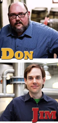
Aside from the pics of the two goofy looking guys it looks nice (I guess WordPress can only fix so much?) Keep doing what you are doing!!
Cheers
The Wookie
Thanks, Wookie. But I think those pics are only half bad. 😉
*sigh*
I’m not digging the comments format on this theme either, but it is a balance between the features you want, the amount of customization, and whether or not you can have a header image with these WordPress themes. Unless you want to pay that is.
As a design professional I’m often times frustrated with the limitations for my own WordPress blog, but have to remind myself it is free.
I think the most important question is whether or not you and Don can live with the changes.
It’s too bad they don’t allow a non-public test drive of the themes (other than the preview function they currently have) to allow you to mess with the customizations for a particular theme before you commit.
I agree. You really don’t know what you’re getting into until you activate the theme (as you say, you can’t play with the customization features until you commit). It’s a little maddening to know exactly what you want and being able to get it – for free!
One suggestion if you keep this theme. I know that you can click on the banner to get to your home page, but it would also be nice to have a tab for it as well.
Yeah Jim, Tab Fail!
You cannot fail if you never try Don.
Words to live by Jim, words to live by…
I agree, but I don’t think it’s possible with this theme. It’s like being handcuffed in a candy store – so close to what you want but unable to get to it!
I do like the calendar at the bottom though!
It’s only been a day and I still am not a fan of the new comment forum, it resembles a paragraph some of my students write….long and never ending.
I fully expect a bourbon thread for derby…who doesnt love mashed up leaves in a glass with bourbon while watching drunk kids run across port-a-potties?
I give up – back to the old layout for us!
Just when I was starting to like the new one… I love how this is “our” site. geez
Don’t be a bear, Don. I was telling my wife about your site last night and she just said “oh geez”.
whatever. I just think this one looks so bloggy.
I agree it’s not ideal, but it’s the best of what’s available. Maybe it’s time we discuss hosting this thing ourselves – then we could be less bloggy.
That’s funny – that’s what MY wife says when I tell her about the site.
I was liking the new layout less and less the more I looked at it. I really don’t think this layout was broken to begin with, although it never hurts to mix it up once in a while!
Thanks, Alex. It wore me down, too. I really like the two-column of posts, but the rest was a bit of a cold mess. And the comments section was broken, and you know how we love our comments around here!
I think that’s really the key, Jim. What really defines your blog to me is that it functions like a conversation, since you and Don are so responsive in the comments section. After a day or so, the site layout didn’t bother me so much as the fact that the design – with the weird comments – seemed to be playing away from one of the things that makes this blog so great.
I’m sure you’ll find a redesign that does everything you want. Nothing to do but keep plugging away…
Agreed, it was like the life’s blood of the site was compromised, and that ain’t cool.
I’m sure a better layout option will come along, but I have no idea when. In the meantime, I still love the site in it’s current form. I just wish I could have a feature article on the top and two columns of posts below it, all with picture. Oh well.